
WPFではデフォルトでトグルスイッチが存在しません。最近のアプリではマテリアルデザイン風のモダンなUIが求められることも多く、トグルスイッチを使ってUIを作りたい場面があります。よりモダンなスタイルをWPFで使えるようにトグルスイッチを定義・適用する方法を解説していきたいと思います。次の流れで解説をおこないます。
この記事で作成するもの
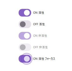
この記事では、上記のマテリアルデザイン風トグルスイッチのスタイルを作成します。ホバーしたときやフォーカスがあたっているときの状態変化にも対応します。
トグルスイッチのスタイル定義
スタイルの作成と適用方法の詳しい解説はこちらの記事を参照ください。ここではToggleButtonのスタイルを変更してトグルスイッチを作っていきます。
<ResourceDictionary xmlns="http://schemas.microsoft.com/winfx/2006/xaml/presentation"
                    xmlns:o="http://schemas.microsoft.com/winfx/2006/xaml/presentation/options"
                    xmlns:x="http://schemas.microsoft.com/winfx/2006/xaml">
  <Style x:Key="FocusVisual">
    <Setter Property="Control.Template">
      <Setter.Value>
        <ControlTemplate>
          <Rectangle Margin="0" StrokeDashArray="1 2" Stroke="{DynamicResource {x:Static SystemColors.ControlTextBrushKey}}" SnapsToDevicePixels="true" StrokeThickness="1"/>
        </ControlTemplate>
      </Setter.Value>
    </Setter>
  </Style>
  <SolidColorBrush x:Key="Ellipse.MouseOver.Fill" Color="#44673AB7" o:Freeze="True"/>
  <SolidColorBrush x:Key="Ellipse.Pressed.Fill" Color="#55673AB7" o:Freeze="True"/>
  <SolidColorBrush x:Key="Ellipse.Focused.Fill" Color="#33673AB7" o:Freeze="True"/>
  <SolidColorBrush x:Key="Ellipse.Focused.Stroke" Color="#CC673AB7" o:Freeze="True"/>
  <SolidColorBrush x:Key="Ellipse.Unchecked.Fill" Color="Transparent" o:Freeze="True"/>
  <SolidColorBrush x:Key="Ellipse.MouseOver.Disabled.Fill" Color="#44D6D0DA" o:Freeze="True"/>
  <SolidColorBrush x:Key="Ellipse.Pressed.Disabled.Fill" Color="#55D6D0DA" o:Freeze="True"/>
  <SolidColorBrush x:Key="Ellipse.Focused.Disabled.Fill" Color="#33D6D0DA" o:Freeze="True"/>
  <SolidColorBrush x:Key="Ellipse.Focused.Disabled.Stroke" Color="#CCD6D0DA" o:Freeze="True"/>
  <SolidColorBrush x:Key="Rectangle.Fill" Color="#CC673AB7" o:Freeze="True"/>
  <SolidColorBrush x:Key="Rectangle.Unchecked.Fill" Color="#FFE6E0E9" o:Freeze="True"/>
  <SolidColorBrush x:Key="SmallElipse.Fill" Color="#FFFFFFFF" o:Freeze="True"/>
  <SolidColorBrush x:Key="SmallEllipse.Unchecked.Fill" Color="#FF79747E" o:Freeze="True"/>
  <Style x:Key="Switch" TargetType="{x:Type ToggleButton}">
    <Setter Property="FocusVisualStyle" Value="{StaticResource FocusVisual}"/>
    <Setter Property="Background" Value="{StaticResource Rectangle.Fill}"/>
    <Setter Property="BorderBrush" Value="Transparent"/>
    <Setter Property="Foreground" Value="{DynamicResource {x:Static SystemColors.ControlTextBrushKey}}"/>
    <Setter Property="BorderThickness" Value="0"/>
    <Setter Property="HorizontalContentAlignment" Value="Center"/>
    <Setter Property="VerticalContentAlignment" Value="Center"/>
    <Setter Property="Margin" Value="0"/>
    <Setter Property="Padding" Value="8,1,1,1"/>
    <Setter Property="Template">
      <Setter.Value>
        <ControlTemplate TargetType="{x:Type ToggleButton}">
          <Grid Background="Transparent" SnapsToDevicePixels="True">
            <StackPanel Orientation="Horizontal" SnapsToDevicePixels="True" HorizontalAlignment="{TemplateBinding HorizontalContentAlignment}" VerticalAlignment="{TemplateBinding VerticalContentAlignment}">
              <Grid>
                <Rectangle x:Name="rectangle" Width="52" Height="32" Fill="{TemplateBinding Background}" RadiusX="15" RadiusY="15"/>
                <Ellipse x:Name="smallElipse" Width="24" Height="24" Fill="{StaticResource SmallElipse.Fill}" HorizontalAlignment="Left">
                  <Ellipse.RenderTransform>
                    <TranslateTransform x:Name="translateTransform"/>
                  </Ellipse.RenderTransform>
                </Ellipse>
                <Ellipse x:Name="ellipse" Width="48" Height="48" Fill="Transparent" Stroke="Transparent">
                  <Ellipse.RenderTransform>
                    <TranslateTransform x:Name="translateTransformHover"/>
                  </Ellipse.RenderTransform>
                </Ellipse>
              </Grid>
              <ContentPresenter x:Name="contentPresenter" Grid.Column="1" Focusable="False" Margin="{TemplateBinding Padding}" RecognizesAccessKey="True" SnapsToDevicePixels="{TemplateBinding SnapsToDevicePixels}" VerticalAlignment="Center"/>
            </StackPanel>
            <VisualStateManager.VisualStateGroups>
              <VisualStateGroup x:Name="CheckStates">
                <VisualState x:Name="Checked">
                  <Storyboard>
                    <DoubleAnimation Storyboard.TargetName="smallElipse" Storyboard.TargetProperty="(UIElement.RenderTransform).(TranslateTransform.X)" To="22" Duration="0:0:0"/>
                    <DoubleAnimation Storyboard.TargetName="ellipse" Storyboard.TargetProperty="(UIElement.RenderTransform).(TranslateTransform.X)" To="7" Duration="0:0:0"/>
                  </Storyboard>
                </VisualState>
                <VisualState x:Name="Unchecked">
                  <Storyboard>
                    <DoubleAnimation Storyboard.TargetName="smallElipse" Storyboard.TargetProperty="(UIElement.RenderTransform).(TranslateTransform.X)" To="5" Duration="0:0:0"/>
                    <DoubleAnimation Storyboard.TargetName="ellipse" Storyboard.TargetProperty="(UIElement.RenderTransform).(TranslateTransform.X)" To="-7" Duration="0:0:0"/>
                  </Storyboard>
                </VisualState>
                <VisualStateGroup.Transitions>
                  <VisualTransition From="Unchecked" To="Checked">
                    <Storyboard>
                      <DoubleAnimation Storyboard.TargetName="smallElipse" Storyboard.TargetProperty="(UIElement.RenderTransform).(TranslateTransform.X)" To="22" Duration="0:0:0.2"/>
                      <DoubleAnimation Storyboard.TargetName="ellipse" Storyboard.TargetProperty="(UIElement.RenderTransform).(TranslateTransform.X)" To="7" Duration="0:0:0.2"/>
                    </Storyboard>
                  </VisualTransition>
                  <VisualTransition From="Checked" To="Unchecked">
                    <Storyboard>
                      <DoubleAnimation Storyboard.TargetName="smallElipse" Storyboard.TargetProperty="(UIElement.RenderTransform).(TranslateTransform.X)" To="5" Duration="0:0:0.2"/>
                      <DoubleAnimation Storyboard.TargetName="ellipse" Storyboard.TargetProperty="(UIElement.RenderTransform).(TranslateTransform.X)" To="-7" Duration="0:0:0.2"/>
                    </Storyboard>
                  </VisualTransition>
                </VisualStateGroup.Transitions>
              </VisualStateGroup>
            </VisualStateManager.VisualStateGroups>
          </Grid>
          <ControlTemplate.Triggers>
            <Trigger Property="IsChecked" Value="false">
              <Setter Property="Fill" TargetName="rectangle" Value="{StaticResource Rectangle.Unchecked.Fill}"/>
              <Setter Property="Fill" TargetName="smallElipse" Value="{StaticResource SmallEllipse.Unchecked.Fill}"/>
              <Setter Property="Fill" TargetName="ellipse" Value="{StaticResource Ellipse.Unchecked.Fill}"/>
            </Trigger>
            <Trigger Property="IsEnabled" Value="false">
              <Setter Property="Opacity" Value="0.56"/>
            </Trigger>
            <MultiDataTrigger>
              <MultiDataTrigger.Conditions>
                <Condition Binding="{Binding IsMouseOver, RelativeSource={RelativeSource Self}}" Value="True" />
                <Condition Binding="{Binding IsChecked, RelativeSource={RelativeSource Self}}" Value="True" />
              </MultiDataTrigger.Conditions>
              <Setter Property="Fill" TargetName="ellipse" Value="{StaticResource Ellipse.MouseOver.Fill}"/>
            </MultiDataTrigger>
            <MultiDataTrigger>
              <MultiDataTrigger.Conditions>
                <Condition Binding="{Binding IsMouseOver, RelativeSource={RelativeSource Self}}" Value="True" />
                <Condition Binding="{Binding IsChecked, RelativeSource={RelativeSource Self}}" Value="False" />
              </MultiDataTrigger.Conditions>
              <Setter Property="Fill" TargetName="ellipse" Value="{StaticResource Ellipse.MouseOver.Disabled.Fill}"/>
            </MultiDataTrigger>
            <MultiDataTrigger>
              <MultiDataTrigger.Conditions>
                <Condition Binding="{Binding IsFocused, RelativeSource={RelativeSource Self}}" Value="True" />
                <Condition Binding="{Binding IsChecked, RelativeSource={RelativeSource Self}}" Value="True" />
              </MultiDataTrigger.Conditions>
              <Setter Property="Fill" TargetName="ellipse" Value="{StaticResource Ellipse.Focused.Fill}"/>
              <Setter Property="Stroke" TargetName="ellipse" Value="{StaticResource Ellipse.Focused.Stroke}"/>
            </MultiDataTrigger>
            <MultiDataTrigger>
              <MultiDataTrigger.Conditions>
                <Condition Binding="{Binding IsFocused, RelativeSource={RelativeSource Self}}" Value="True" />
                <Condition Binding="{Binding IsChecked, RelativeSource={RelativeSource Self}}" Value="False" />
              </MultiDataTrigger.Conditions>
              <Setter Property="Fill" TargetName="ellipse" Value="{StaticResource Ellipse.Focused.Disabled.Fill}"/>
              <Setter Property="Stroke" TargetName="ellipse" Value="{StaticResource Ellipse.Focused.Disabled.Stroke}"/>
            </MultiDataTrigger>
            <MultiDataTrigger>
              <MultiDataTrigger.Conditions>
                <Condition Binding="{Binding IsPressed, RelativeSource={RelativeSource Self}}" Value="True" />
                <Condition Binding="{Binding IsChecked, RelativeSource={RelativeSource Self}}" Value="True" />
              </MultiDataTrigger.Conditions>
              <Setter Property="Fill" TargetName="ellipse" Value="{StaticResource Ellipse.Pressed.Fill}"/>
            </MultiDataTrigger>
            <MultiDataTrigger>
              <MultiDataTrigger.Conditions>
                <Condition Binding="{Binding IsPressed, RelativeSource={RelativeSource Self}}" Value="True" />
                <Condition Binding="{Binding IsChecked, RelativeSource={RelativeSource Self}}" Value="False" />
              </MultiDataTrigger.Conditions>
              <Setter Property="Fill" TargetName="ellipse" Value="{StaticResource Ellipse.Pressed.Disabled.Fill}"/>
            </MultiDataTrigger>
          </ControlTemplate.Triggers>
        </ControlTemplate>
      </Setter.Value>
    </Setter>
  </Style>
</ResourceDictionary>
トグルスイッチの適用方法
作成したスタイルをToggleButtonに適用していきます。適用方法は下記の通りです。
<ToggleButton
  Style="{StaticResource Switch}"
  IsChecked="True"
  Content="ON"/>
注意点
- App.xamlの辞書に、定義したトグルスイッチのスタイルファイルを登録し忘れないようにする(詳細についてはこちらの記事を参照)
- トグルスイッチの状態を意識して色を定義すると実用的になる