
この記事では、WPFで使えるButtonスタイルを3種類(Raised / Outline / Flat)用意し、スタイルを定義・適用する方法を解説します。次の流れで解説しています。
- WPFのデフォルトボタンは地味?
- この記事で作成するもの
- デフォルトスタイルをコピーする方法
- スタイルを別ファイル(ResourceDictionary)に定義する
- App.xaml に登録して全画面で使えるようにする
- Buttonのスタイル定義と適用
- 注意点
WPFのデフォルトボタンは地味?
WPFのデフォルトボタンはシンプルで業務システム向けですが、最近のアプリではマテリアルデザイン風のモダンなUIが求められることも多いです。よってよりモダンなスタイルを定義・適用する方法を解説していきたいと思います。
この記事で作成するもの
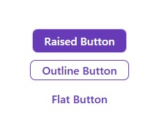
この記事では上の3種類のボタンを作っていきたいと思います。
デフォルトスタイルをコピーする方法
Visual Studio 2022 のWPFアプリケーションプロジェクトを使用して行っていきます。以下の手順でボタンのデフォルトスタイルを表示します:
- XAMLウィンドウにButtonコントロールを追加する
- Visual Studioのメニューから 表示 > その他のウィンドウ > ドキュメントアウトライン を表示する
- ドキュメントアウトラインのButtonを右クリックし、テンプレートの編集 > コピーして編集 を選択
- デフォルトの設定のままOKボタンを押下する
- Buttonのデフォルトスタイルが表示される
このデフォルトスタイルを変更することにより、自身で好きなスタイルを作成することができます。
スタイルを別ファイル(ResourceDictionary)に定義する
先程の5.で表示したスタイルを変更していきたいと思います。ただし、このXAMLウィンドウにスタイル定義をすると、このウィンドウのButtonにしかそのスタイルを適用する事ができません。そのため別フォルダにスタイルを定義し、どのウィンドウからでも自身が定義したスタイルを使えるようにしていきたいと思います。まずはRaisedButtonのスタイル定義を以下の手順で作っていきたいと思います:
- 現在のプロジェクトにStylesフォルダを作る
- Stylesフォルダを右クリックし、追加 > リソースディクショナリ をクリック
- 名前にRaisedButtonと入力して追加ボタンを押下
- RaisedButton.xamlファイルができる
- RaisedButton.xamlに5.で表示したButtonのデフォルトスタイルを貼り付ける
5.で表示したButtonのデフォルトスタイルをXAMLウィンドウに残したままにしている方は消して大丈夫です。ResourceDictionaryにあるStyleを適用することでエラーが出ないようになります。
App.xaml に登録して全画面で使えるようにする
次にResourceDictionaryにあるStyleをXAMLウィンドウにあるButtonに適用できるようにしていきます。APP.xamlファイルを開いて以下のコードを追加します:
  <Application.Resources>
    <ResourceDictionary>
      <ResourceDictionary.MergedDictionaries>
        <ResourceDictionary Source="/Styles/RaisedButton.xaml"/>
      </ResourceDictionary.MergedDictionaries>
    </ResourceDictionary>
  </Application.Resources>
これを追加することで、全画面で同じResourceDictionary(RaisedButton.xaml)にあるスタイルを使用することができるようになります。
Buttonのスタイル定義と適用
RaisedButton.xamlファイルに戻り、下記の内容へと変更します:
RaisedButtonのスタイル定義
<ResourceDictionary xmlns="http://schemas.microsoft.com/winfx/2006/xaml/presentation"
                    xmlns:o="http://schemas.microsoft.com/winfx/2006/xaml/presentation/options"
                    xmlns:x="http://schemas.microsoft.com/winfx/2006/xaml">
  <Style x:Key="FocusVisual">
    <Setter Property="Control.Template">
      <Setter.Value>
        <ControlTemplate>
          <Rectangle Margin="2" StrokeDashArray="1 2" Stroke="{DynamicResource {x:Static SystemColors.ControlTextBrushKey}}" SnapsToDevicePixels="true" StrokeThickness="1"/>
        </ControlTemplate>
      </Setter.Value>
    </Setter>
  </Style>
  <SolidColorBrush x:Key="Button.Static.Background" Color="#FF673ab7" o:Freeze="True"/>
  <SolidColorBrush x:Key="Button.Static.Border" Color="#33673AB7" o:Freeze="True"/>
  <SolidColorBrush x:Key="Button.Static.Foreground" Color="#FFFFFFFF" o:Freeze="True"/>
  <SolidColorBrush x:Key="Button.MouseOver.Background" Color="#CC673AB7" o:Freeze="True"/>
  <SolidColorBrush x:Key="Button.Pressed.Background" Color="#EE673AB7" o:Freeze="True"/>
  <Style x:Key="RaisedButton" TargetType="{x:Type Button}">
    <Setter Property="FocusVisualStyle" Value="{StaticResource FocusVisual}"/>
    <Setter Property="Background" Value="{StaticResource Button.Static.Background}"/>
    <Setter Property="BorderBrush" Value="{StaticResource Button.Static.Border}"/>
    <Setter Property="Foreground" Value="{StaticResource Button.Static.Foreground}"/>
    <Setter Property="BorderThickness" Value="1"/>
    <Setter Property="HorizontalContentAlignment" Value="Center"/>
    <Setter Property="VerticalContentAlignment" Value="Center"/>
    <Setter Property="Padding" Value="16,6"/>
    <Setter Property="Cursor" Value="Hand"/>
    <Setter Property="FontWeight" Value="Bold"/>
    <Setter Property="FontSize" Value="16"/>
    <Setter Property="Template">
      <Setter.Value>
        <ControlTemplate TargetType="{x:Type Button}">
          <Border
            x:Name="border"
            Background="{TemplateBinding Background}"
            BorderBrush="{TemplateBinding BorderBrush}"
            BorderThickness="{TemplateBinding BorderThickness}"
            SnapsToDevicePixels="true"
            CornerRadius="7"
            Cursor="{TemplateBinding Cursor}">
            <ContentPresenter
              x:Name="contentPresenter"
              Focusable="False"
              HorizontalAlignment="{TemplateBinding HorizontalContentAlignment}"
              Margin="{TemplateBinding Padding}"
              RecognizesAccessKey="True"
              SnapsToDevicePixels="{TemplateBinding SnapsToDevicePixels}"
              VerticalAlignment="{TemplateBinding VerticalContentAlignment}"/>
          </Border>
          <ControlTemplate.Triggers>
            <Trigger Property="IsMouseOver" Value="true">
              <Setter Property="Background" TargetName="border" Value="{StaticResource Button.MouseOver.Background}"/>
            </Trigger>
            <Trigger Property="IsPressed" Value="true">
              <Setter Property="Background" TargetName="border" Value="{StaticResource Button.Pressed.Background}"/>
            </Trigger>
            <Trigger Property="IsEnabled" Value="false">
              <Setter Property="Opacity" Value="0.56"/>
            </Trigger>
          </ControlTemplate.Triggers>
        </ControlTemplate>
      </Setter.Value>
    </Setter>
  </Style>
</ResourceDictionary>
XAMLウィンドウに戻り、上記のスタイルを適用します。方法は以下のとおりです。
  <Button
    Style="{StaticResource RaisedButton}"
    Content="Raised Button"/>
これでRaisedButtonのスタイル定義と適用が完了しました。
同様にOutlineButtonとFlatButtonのスタイル定義を行うことで、(Outline / Flat) ボタンを作成することができます。定義は以下のとおりです:
OutlinedButtonのスタイル定義
<ResourceDictionary xmlns="http://schemas.microsoft.com/winfx/2006/xaml/presentation"
                    xmlns:o="http://schemas.microsoft.com/winfx/2006/xaml/presentation/options"
                    xmlns:x="http://schemas.microsoft.com/winfx/2006/xaml">
  <Style x:Key="FocusVisual">
    <Setter Property="Control.Template">
      <Setter.Value>
        <ControlTemplate>
          <Rectangle Margin="2" StrokeDashArray="1 2" Stroke="{DynamicResource {x:Static SystemColors.ControlTextBrushKey}}" SnapsToDevicePixels="true" StrokeThickness="1"/>
        </ControlTemplate>
      </Setter.Value>
    </Setter>
  </Style>
  <SolidColorBrush x:Key="Button.Static.Background" Color="Transparent" o:Freeze="True"/>
  <SolidColorBrush x:Key="Button.Static.Border" Color="#FF673AB7" o:Freeze="True"/>
  <SolidColorBrush x:Key="Button.Static.Foreground" Color="#FF673AB7" o:Freeze="True"/>
  <SolidColorBrush x:Key="Button.MouseOver.Background" Color="#33673AB7" o:Freeze="True"/>
  <SolidColorBrush x:Key="Button.Pressed.Background" Color="#55673AB7" o:Freeze="True"/>
  <Style x:Key="OutlinedButton" TargetType="{x:Type Button}">
    <Setter Property="FocusVisualStyle" Value="{StaticResource FocusVisual}"/>
    <Setter Property="Background" Value="{StaticResource Button.Static.Background}"/>
    <Setter Property="BorderBrush" Value="{StaticResource Button.Static.Border}"/>
    <Setter Property="Foreground" Value="{StaticResource Button.Static.Foreground}"/>
    <Setter Property="BorderThickness" Value="1"/>
    <Setter Property="HorizontalContentAlignment" Value="Center"/>
    <Setter Property="VerticalContentAlignment" Value="Center"/>
    <Setter Property="Padding" Value="16,3"/>
    <Setter Property="FontWeight" Value="Bold"/>
    <Setter Property="FontSize" Value="16"/>
    <Setter Property="Template">
      <Setter.Value>
        <ControlTemplate TargetType="{x:Type Button}">
          <Border
            x:Name="border"
            Background="{TemplateBinding Background}"
            BorderBrush="{TemplateBinding BorderBrush}"
            BorderThickness="{TemplateBinding BorderThickness}"
            SnapsToDevicePixels="true"
            CornerRadius="7"
            Cursor="{TemplateBinding Cursor}">
            <ContentPresenter
              x:Name="contentPresenter"
              Focusable="False"
              HorizontalAlignment="{TemplateBinding HorizontalContentAlignment}"
              Margin="{TemplateBinding Padding}"
              RecognizesAccessKey="True"
              SnapsToDevicePixels="{TemplateBinding SnapsToDevicePixels}"
              VerticalAlignment="{TemplateBinding VerticalContentAlignment}"/>
          </Border>
          <ControlTemplate.Triggers>
            <Trigger Property="IsMouseOver" Value="true">
              <Setter Property="Background" TargetName="border" Value="{StaticResource Button.MouseOver.Background}"/>
            </Trigger>
            <Trigger Property="IsPressed" Value="true">
              <Setter Property="Background" TargetName="border" Value="{StaticResource Button.Pressed.Background}"/>
            </Trigger>
            <Trigger Property="IsEnabled" Value="false">
              <Setter Property="Opacity" Value="0.56"/>
            </Trigger>
          </ControlTemplate.Triggers>
        </ControlTemplate>
      </Setter.Value>
    </Setter>
  </Style>
</ResourceDictionary>
FlatButtonのスタイル定義
<ResourceDictionary xmlns="http://schemas.microsoft.com/winfx/2006/xaml/presentation"
                    xmlns:o="http://schemas.microsoft.com/winfx/2006/xaml/presentation/options"
                    xmlns:x="http://schemas.microsoft.com/winfx/2006/xaml">
  <Style x:Key="FocusVisual">
    <Setter Property="Control.Template">
      <Setter.Value>
        <ControlTemplate>
          <Rectangle Margin="2" StrokeDashArray="1 2" Stroke="{DynamicResource {x:Static SystemColors.ControlTextBrushKey}}" SnapsToDevicePixels="true" StrokeThickness="1"/>
        </ControlTemplate>
      </Setter.Value>
    </Setter>
  </Style>
  <SolidColorBrush x:Key="Button.Static.Background" Color="Transparent" o:Freeze="True"/>
  <SolidColorBrush x:Key="Button.Static.Border" Color="#33673AB7" o:Freeze="True"/>
  <SolidColorBrush x:Key="Button.Static.Foreground" Color="#FF673AB7" o:Freeze="True"/>
  <SolidColorBrush x:Key="Button.MouseOver.Background" Color="#33673AB7" o:Freeze="True"/>
  <SolidColorBrush x:Key="Button.Pressed.Background" Color="#88673AB7" o:Freeze="True"/>
  <Style x:Key="FlatButton" TargetType="{x:Type Button}">
    <Setter Property="FocusVisualStyle" Value="{StaticResource FocusVisual}"/>
    <Setter Property="Background" Value="{StaticResource Button.Static.Background}"/>
    <Setter Property="BorderBrush" Value="{StaticResource Button.Static.Border}"/>
    <Setter Property="Foreground" Value="{StaticResource Button.Static.Foreground}"/>
    <Setter Property="BorderThickness" Value="0"/>
    <Setter Property="HorizontalContentAlignment" Value="Center"/>
    <Setter Property="VerticalContentAlignment" Value="Center"/>
    <Setter Property="Padding" Value="16,6"/>
    <Setter Property="Cursor" Value="Hand"/>
    <Setter Property="FontWeight" Value="Bold"/>
    <Setter Property="FontSize" Value="16"/>
    <Setter Property="Template">
      <Setter.Value>
        <ControlTemplate TargetType="{x:Type Button}">
          <Border
            x:Name="border"
            Background="{TemplateBinding Background}"
            BorderBrush="{TemplateBinding BorderBrush}"
            BorderThickness="{TemplateBinding BorderThickness}"
            SnapsToDevicePixels="true"
            CornerRadius="7"
            Cursor="{TemplateBinding Cursor}">
            <ContentPresenter
              x:Name="contentPresenter"
              Focusable="False"
              HorizontalAlignment="{TemplateBinding HorizontalContentAlignment}"
              Margin="{TemplateBinding Padding}"
              RecognizesAccessKey="True"
              SnapsToDevicePixels="{TemplateBinding SnapsToDevicePixels}"
              VerticalAlignment="{TemplateBinding VerticalContentAlignment}"/>
          </Border>
          <ControlTemplate.Triggers>
            <Trigger Property="IsMouseOver" Value="true">
              <Setter Property="Background" TargetName="border" Value="{StaticResource Button.MouseOver.Background}"/>
            </Trigger>
            <Trigger Property="IsPressed" Value="true">
              <Setter Property="Background" TargetName="border" Value="{StaticResource Button.Pressed.Background}"/>
            </Trigger>
            <Trigger Property="IsEnabled" Value="false">
              <Setter Property="Opacity" Value="0.56"/>
            </Trigger>
          </ControlTemplate.Triggers>
        </ControlTemplate>
      </Setter.Value>
    </Setter>
  </Style>
</ResourceDictionary>
注意点
- App.xamlの辞書に、定義したスタイルファイルを登録し忘れないようにする
- ボタンの状態(Hover, Pressed, Disabled)を意識して色を定義すると実用的になる
コメント
“【WPF】XAMLのButtonをマテリアルデザイン風のモダンな感じに変更する方法” への4件のフィードバック
[…] スタイルの作成と適用方法の詳しい解説はこちらの記事を参照ください。ここではToggleButtonのスタイルを変更してトグルスイッチを作っていきたいと思います。 […]
[…] スタイルの作成と適用方法の詳しい解説はこちらの記事を参照ください。ここではCheckBoxのスタイルを変更してモダンなスタイルを作っていきます。 […]
[…] スタイルの作成と適用方法の詳しい解説はこちらの記事を参照ください。ここではRadioButtonのスタイルを変更してモダンなスタイルを作っていきます。 […]
[…] スタイルの作成と適用方法の詳しい解説はこちらの記事を参照ください。ここではIconButtonのスタイルを変更してモダンなスタイルを作っていきます。 […]