
WPFのラジオボタンはシンプルで業務システム向けですが、最近のアプリではマテリアルデザイン風のモダンなUIが求められることも多いです。よってこの記事ではよりモダンなRadioButtonのスタイルを定義する方法を解説していきたいと思います。次の流れで解説をおこないます。
この記事で作成するもの
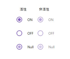
この記事では、上記のマテリアルデザイン風ラジオボタンのスタイルを作成します。ホバーしたときやフォーカスがあたっているときの状態変化にも対応します。
RadioButtonのスタイル定義
スタイルの作成と適用方法の詳しい解説はこちらの記事を参照ください。ここではRadioButtonのスタイルを変更してモダンなスタイルを作っていきます。
  <Style x:Key="FocusVisual">
    <Setter Property="Control.Template">
      <Setter.Value>
        <ControlTemplate>
          <Rectangle Margin="2" StrokeDashArray="1 2" Stroke="{DynamicResource {x:Static SystemColors.ControlTextBrushKey}}" SnapsToDevicePixels="true" StrokeThickness="1"/>
        </ControlTemplate>
      </Setter.Value>
    </Setter>
  </Style>
  <SolidColorBrush x:Key="RadioButton.Static.Background" Color="#FFFFFFFF" o:Freeze="True"/>
  <SolidColorBrush x:Key="RadioButton.Static.Border" Color="#CC673AB7" o:Freeze="True"/>
  <SolidColorBrush x:Key="RadioButton.Static.Glyph" Color="#CC673AB7" o:Freeze="True"/>
  <SolidColorBrush x:Key="Circle.MouseOver.Background" Color="#44673AB7" o:Freeze="True"/>
  <SolidColorBrush x:Key="Circle.Focused.Background" Color="#44673AB7" o:Freeze="True"/>
  <SolidColorBrush x:Key="Circle.Focused.BorderBrush" Color="#CC673AB7" o:Freeze="True"/>
  <SolidColorBrush x:Key="Circle.Pressed.Background" Color="#55673AB7" o:Freeze="True"/>
  <Style x:Key="RadioButton" TargetType="{x:Type RadioButton}">
    <Setter Property="FocusVisualStyle" Value="{StaticResource FocusVisual}"/>
    <Setter Property="Background" Value="{StaticResource RadioButton.Static.Background}"/>
    <Setter Property="BorderBrush" Value="{StaticResource RadioButton.Static.Border}"/>
    <Setter Property="Foreground" Value="{DynamicResource {x:Static SystemColors.ControlTextBrushKey}}"/>
    <Setter Property="BorderThickness" Value="2"/>
    <Setter Property="HorizontalContentAlignment" Value="Left"/>
    <Setter Property="VerticalContentAlignment" Value="Center"/>
    <Setter Property="Template">
      <Setter.Value>
        <ControlTemplate TargetType="{x:Type RadioButton}">
          <Grid x:Name="templateRoot" Background="Transparent" SnapsToDevicePixels="True">
            <DockPanel HorizontalAlignment="{TemplateBinding HorizontalContentAlignment}" VerticalAlignment="{TemplateBinding VerticalAlignment}">
              <Border x:Name="Circle" DockPanel.Dock="Left" Width="48" Height="48" Background="Transparent" CornerRadius="100" BorderThickness="1">
                <Border x:Name="radioButtonBorder" Width="20" Height="20" Background="Transparent" BorderBrush="{TemplateBinding BorderBrush}" BorderThickness="{TemplateBinding BorderThickness}" CornerRadius="100" HorizontalAlignment="Center" Margin="1,1,2,1" VerticalAlignment="Center">
                  <Grid x:Name="markGrid" Margin="2">
                    <Ellipse x:Name="optionMark" Width="10" Height="10" Fill="{StaticResource RadioButton.Static.Glyph}" MinWidth="6" MinHeight="6" Opacity="0"/>
                  </Grid>
                </Border>
              </Border>
              <ContentPresenter x:Name="contentPresenter" Grid.Column="1" Focusable="False" HorizontalAlignment="{TemplateBinding HorizontalContentAlignment}" Margin="{TemplateBinding Padding}" RecognizesAccessKey="True" SnapsToDevicePixels="{TemplateBinding SnapsToDevicePixels}" VerticalAlignment="{TemplateBinding VerticalContentAlignment}"/>
            </DockPanel>
          </Grid>
          <ControlTemplate.Triggers>
            <Trigger Property="HasContent" Value="true">
              <Setter Property="Padding" Value="4,0,0,0"/>
            </Trigger>
            <Trigger Property="IsMouseOver" Value="true">
              <Setter Property="Background" TargetName="Circle" Value="{StaticResource Circle.MouseOver.Background}"/>
            </Trigger>
            <Trigger Property="IsFocused" Value="True">
              <Setter Property="Background" TargetName="Circle" Value="{StaticResource Circle.Focused.Background}"/>
              <Setter Property="BorderBrush" TargetName="Circle" Value="{StaticResource Circle.Focused.BorderBrush}"/>
            </Trigger>
            <Trigger Property="IsEnabled" Value="false">
              <Setter Property="Opacity" Value="0.56"/>
            </Trigger>
            <Trigger Property="IsPressed" Value="true">
              <Setter Property="Background" TargetName="Circle" Value="{StaticResource Circle.Pressed.Background}"/>
            </Trigger>
            <Trigger Property="IsChecked" Value="true">
              <Setter Property="Opacity" TargetName="optionMark" Value="1"/>
            </Trigger>
            <Trigger Property="IsChecked" Value="{x:Null}">
              <Setter Property="Opacity" TargetName="optionMark" Value="0.56"/>
            </Trigger>
          </ControlTemplate.Triggers>
        </ControlTemplate>
      </Setter.Value>
    </Setter>
  </Style>
</ResourceDictionary>
RadioButtonの適用方法
作成したスタイルをRadioButtonのスタイルに適用していきます。適用方法は下記の通りです。
<RadioButton
  Style="{StaticResource RadioButton}"
  IsChecked="True"
  Content="ON"/>
注意点
- App.xamlの辞書に、定義したRadioButtonのスタイルファイルを登録し忘れないようにする(詳細についてはこちらの記事を参照)
- ラジオボタンの状態を意識して色を定義すると実用的になる